Website · 2026
Sala de Armas Laguna de Duero
The website of the first fencing club in Laguna de Duero (Valladolid): the club, the three weapons, the hall, timetables, fees and licences, with the free first class one WhatsApp message away.
- React
The brief
A club opening its doors in 2026, in a town with no fencing tradition. It needed a website before it had students, and three things mattered more than the rest.
A sport almost nobody has tried
Visitors don't know what a foil is or whether this is for them. The site had to explain before it could sell.
A club with no past to show
No trophies, no competition photos. Trust had to come from the tone and the care in every detail.
A season with a start date
Places for 2026/27 fill up in September. The site had to be ready in time and lead straight to the first class.
The process
- Phase 1
Listen to the club
What they offer, to whom, when and for how much. And what first-time enquirers always ask.
- Phase 2
Order the content
A single page, in the order of the questions: what it is, who you are, where, when and how much.
- Phase 3
Visual direction
The palette comes from the club's crest; the type, from the contrast between tradition and sport.
- Phase 4
Build
React components, designed mobile-first, with every menu link jumping to its section.
- Phase 5
Launch
Its own domain, HTTPS, and every WhatsApp and email link tested one by one before going live.
A fencing hall, at night
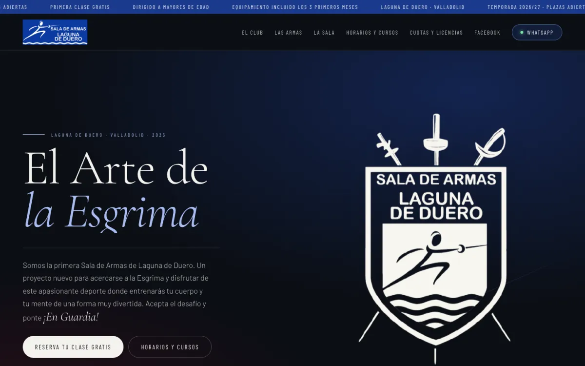
The club's crest is blue and white. The palette starts there and pushes it towards an almost-black ink so the crest and the photos glow on top, and it alternates dark bands with bone-coloured ones so every change of topic shows without reading the label.
The type tells the other half: a classic serif for the old craft — the one in the italic '¡En Guardia!' — and a condensed sports-signage face for everything read at a glance.
- #0B0E14
Night ink
Background of the dark bands
- #F4F2EE
Bone
Text on dark and background of the light bands
- #1B3A8C
Crest blue
Ticker and closing call to action
- #A8BCF0
Steel blue
Italics and details on dark
- #C4132E
Piste red
Only what mustn't be missed
El Arte de la Esgrima
Cormorant Garamond
Headlines and quotes: the tradition
¡En Guardia!
Cormorant Garamond · cursiva
Emphasis, always in steel blue
Barlow Condensed
Menu, labels and buttons: the sport
Barlow
Body text
The page, top to bottom
A single page, ordered the way a newcomer's questions come: what is this, who are you, what would I do, where, when and how much. Every menu link jumps to its band.
The hall is the longest band on purpose: it's where people decide whether they can picture themselves training there.
01.Header125 px
ticker with the essentials, and the menu
02.Hero990 px
headline, crest and the two calls to action
03.Manifesto966 px
what fencing rewards, in one sentence
04.The club990 px
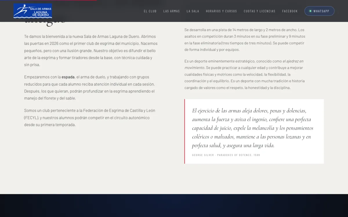
who they are and what fencing is
05.The weapons1083 px
foil, épée and sabre, with their rules
06.The hall1664 px
photos, address and directions
07.Timetable and courses1006 px
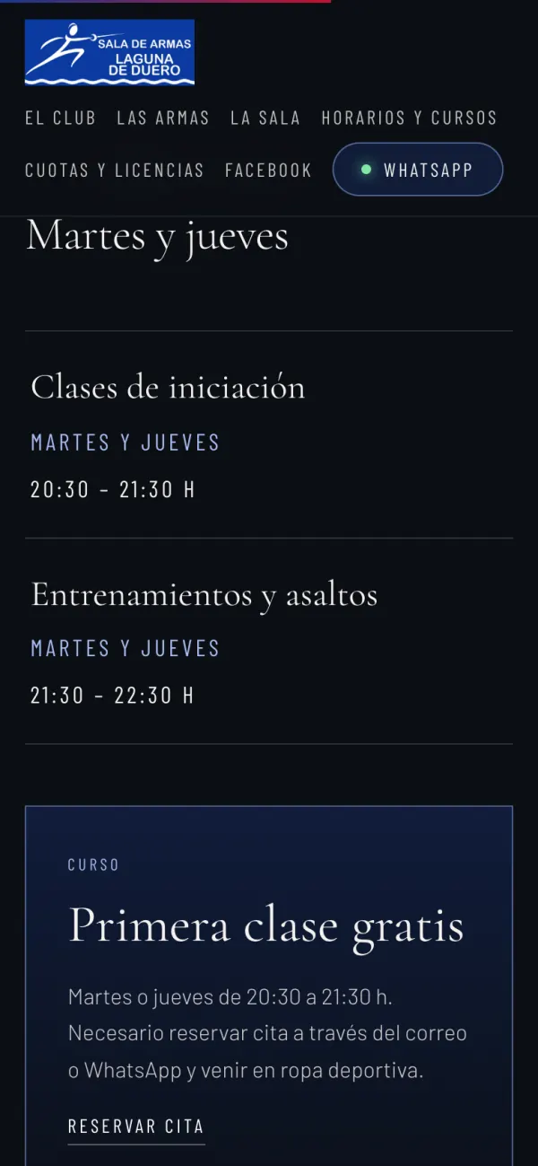
two slots, Tuesdays and Thursdays
08.Fees and licences1046 px
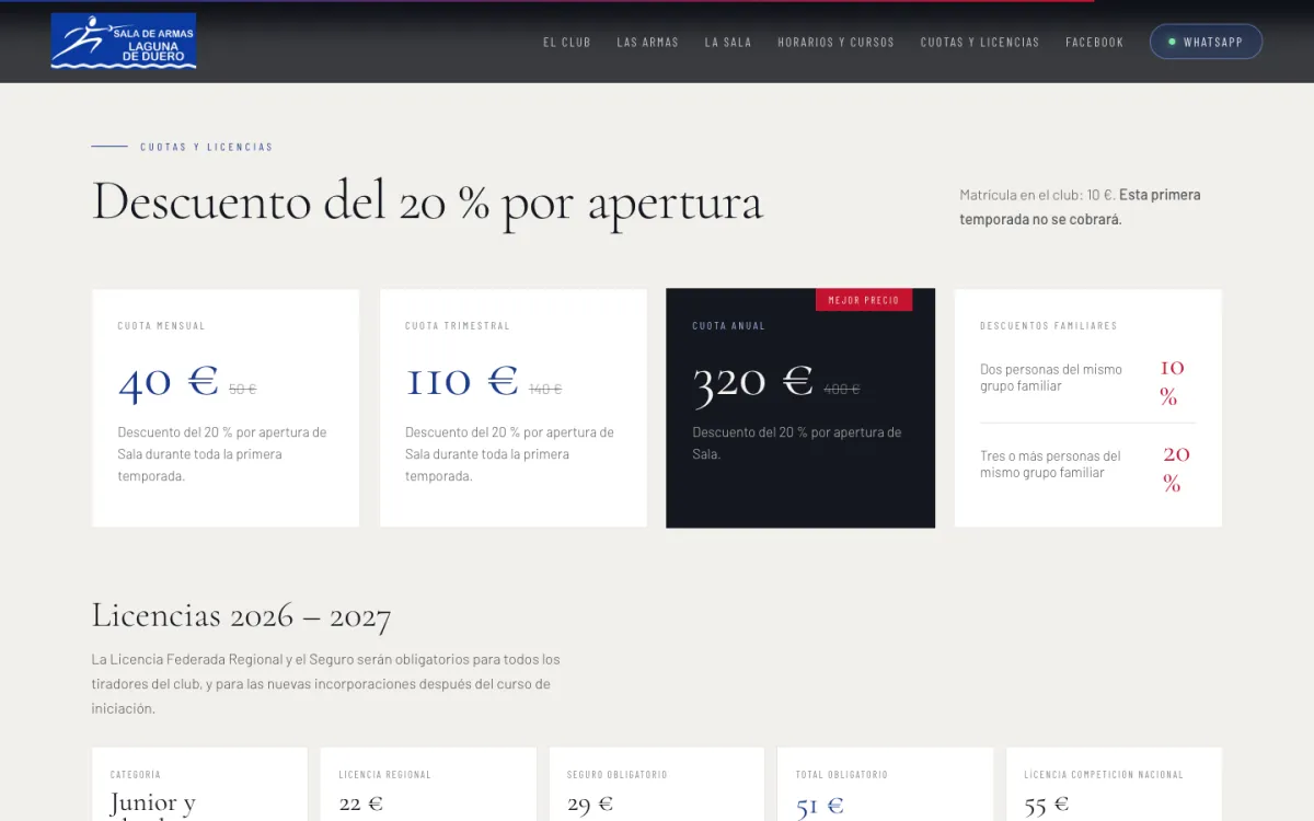
the opening discount, in plain sight
09.Closing call704 px
'Accept the challenge'
10.Footer487 px
sponsors and contact
One tap to the first class
No forms, no sign-up: someone on the fence about trying gives up by the third field. The club already talked to people on WhatsApp, so the site takes them there, with the message already written so all that's left is to send it.
- 01'Book your free class'in the hero, the timetable and the closing call
- 02WhatsApp, with the message already written'Hi, I'd like to book the free fencing trial class.' (in Spanish)
- 03First class, in sportswearthe club provides the kit for the first three months
- 04Registrationthe form is downloaded from the site itself
By email
with the subject line already filled in
By WhatsApp
with a message for sending the completed form
- 05Club fencer
On a phone
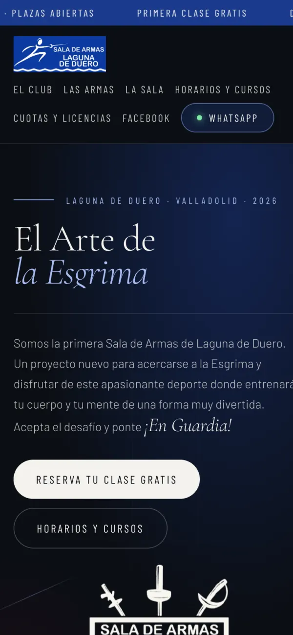
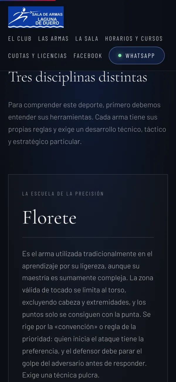
Anyone arriving from Facebook or a WhatsApp group arrives with a phone in hand, so the page was designed at that width first: the menu wraps onto two lines rather than hiding behind an icon, and every weapon, timetable and fee reads as a card.
Decisions you don't notice
None of them draws attention, and that's the point: nobody should have to message the club to ask something the site could have told them.
Explain before selling
Foil, épée and sabre each get their own card: where you can hit, how points are scored, what it demands. Nobody turns up to the first class not knowing what it's about.
Prices, no small print
Monthly, quarterly and yearly fees with the old price struck through, family discounts and the cost of each licence. 'How much is it?' is already answered.
The essentials, even if you don't scroll
The ticker repeats what decides a visit: places open, first class free, adults only, kit included.
Who it's for, said up front
'For adults' comes before anything else. It spares the club the messages from people looking for classes for their children.
Directions, one tap away
The button opens Google Maps with the sports centre already set as the destination, not an address to copy.
One red, and only one
Piste red is saved for the best-value fee. If it showed up anywhere else, it would stop pointing at anything.
The site in numbers
- 1page, with nine bands
- 3weapons explained
- 1tap to WhatsApp
- 0forms to fill in to try it
- 3typefaces
- 5colours, one of them held back
What I took away
A small site still needs an order
Ordering the sections by a newcomer's questions, not by how the club sees itself, is what lets a single page read straight through.
Go where the conversation already is
A form would have been one more channel to keep up with. WhatsApp was the one the club already answered.
With no track record, care stands in
A newborn club has no trophies to show. The type, the tone and every link working are what say it's serious.
Specifics persuade more than polish
The bands that matter most are the least showy ones: timetable, fees and directions.
And in your case?
Do you run a club, a school or a business that still has no website?
This one was for a fencing club starting from scratch, but the challenge — getting someone who doesn't know you to understand what you do and take the first step without having to ask — is the same for almost any small business. I take freelance projects alongside my job, and if you tell me about yours I'll say plainly whether I can help.
Tell me about it →