Website · 2026
Aesthetic medicine clinic
The website of an aesthetic medicine practice in central Valladolid: twelve treatments explained in the visitor's own language, an introduction to the doctor and booking one tap away.
- WordPress
- Elementor
The brief
A practice with twenty-six years of experience and no website to match. In aesthetic medicine trust is decided in seconds, and not everything can be said.
It's healthcare, not cosmetics
Healthcare advertising has rules: a visible health registration number and no promised results.
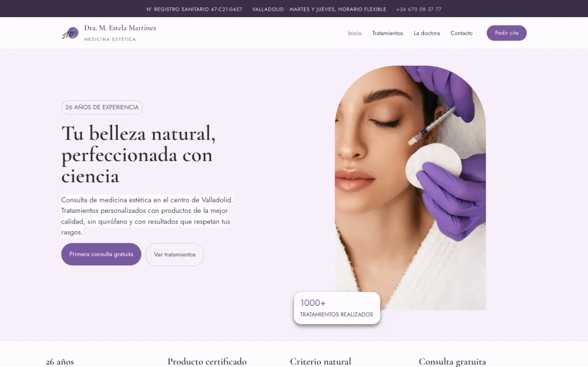
Trust is decided at the top
Someone looking for a treatment compares several practices in a few minutes. What they see first has to be enough.
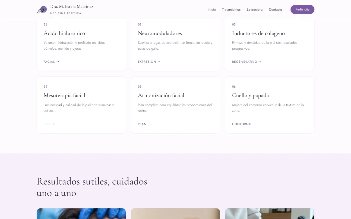
Twelve treatments with technical names
Nobody searches for 'neuromodulators': they want to soften frown lines. The catalogue needed translating.
The practice must be able to edit it
Copy, treatments and hours change. The practice had to be able to update them without depending on anyone.
The process
- Phase 1
Get to know the practice
Which treatments it offers, with what approach, and what first-time callers always ask.
- Phase 2
Architecture
Three pages: a homepage that persuades, a catalogue that explains and a contact page that makes booking easy.
- Phase 3
Visual direction
Plum and lavender for a warm medical practice, far from both surgical white and spa pink.
- Phase 4
Build in WordPress
Elementor templates so every treatment is edited the same way as the rest.
- Phase 5
Legal and launch
Legal notice, privacy and cookie policies and a consent manager before going live.
A clinic, not a spa
The risk in this sector is looking like a beauty salon or an operating theatre. The palette looks for the middle ground: a deep plum that carries medical authority, lavenders that soften it, and a single mauve that is the colour of booking.
An elegant serif for the headlines, which is what people remember, and a clean geometric sans for everything else, which is what they read.
- #33263F
Plum
Headlines, text and footer
- #7A5AA0
Mauve
Only for booking
- #D9CCE6
Lavender
Borders and dividers
- #F6F0FB
Pale lavender
Alternating bands
- #FDFBFE
Off-white
Main background
Tu belleza natural, perfeccionada con ciencia
Cormorant Garamond
Headlines: what's remembered
Primera consulta gratuita
Jost
Text, menu and buttons: what's read
Three pages and a homepage that persuades
The homepage answers, in order, what someone new to the practice wonders: is it serious? what does it do? how will I look? who will treat me? what am I committing to? Any remaining doubts get their own place at the end, in the FAQ.
01.Header121 px
health registration, hours, phone and 'Book'
02.Hero714 px
the promise and the free first consultation
03.Assurances130 px
experience, product, approach and consultation
04.Featured treatments759 px
six of the twelve, by what they achieve
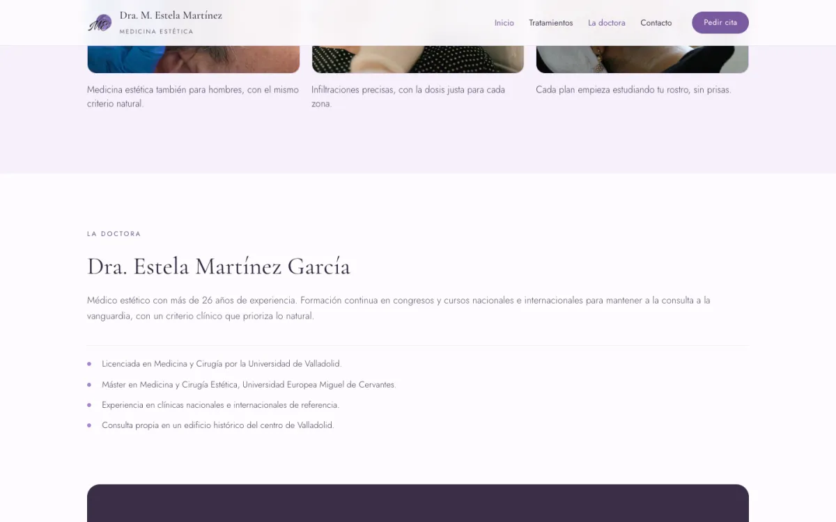
05.Results765 px
photos from the practice, one line each
06.The doctor537 px
training and career
07.Advice467 px
the call to request an assessment
08.FAQ593 px
the questions before calling
09.Footer294 px
contact and legal pages
The catalogue, in the visitor's language
Each treatment is shown with its technical name, because that's what the doctor will say in the consultation, but right underneath comes what it achieves and where. The homepage shows six; the treatments page, all twelve.
Neuromodulators
'Softens expression lines on the forehead, between the brows and around the eyes.'
Collagen stimulators
'Firmer, denser skin with gradual results.'
Facial mesotherapy
'Radiance and skin quality with vitamins and actives.'
Facial harmonisation
'A full plan to balance the proportions of the face.'
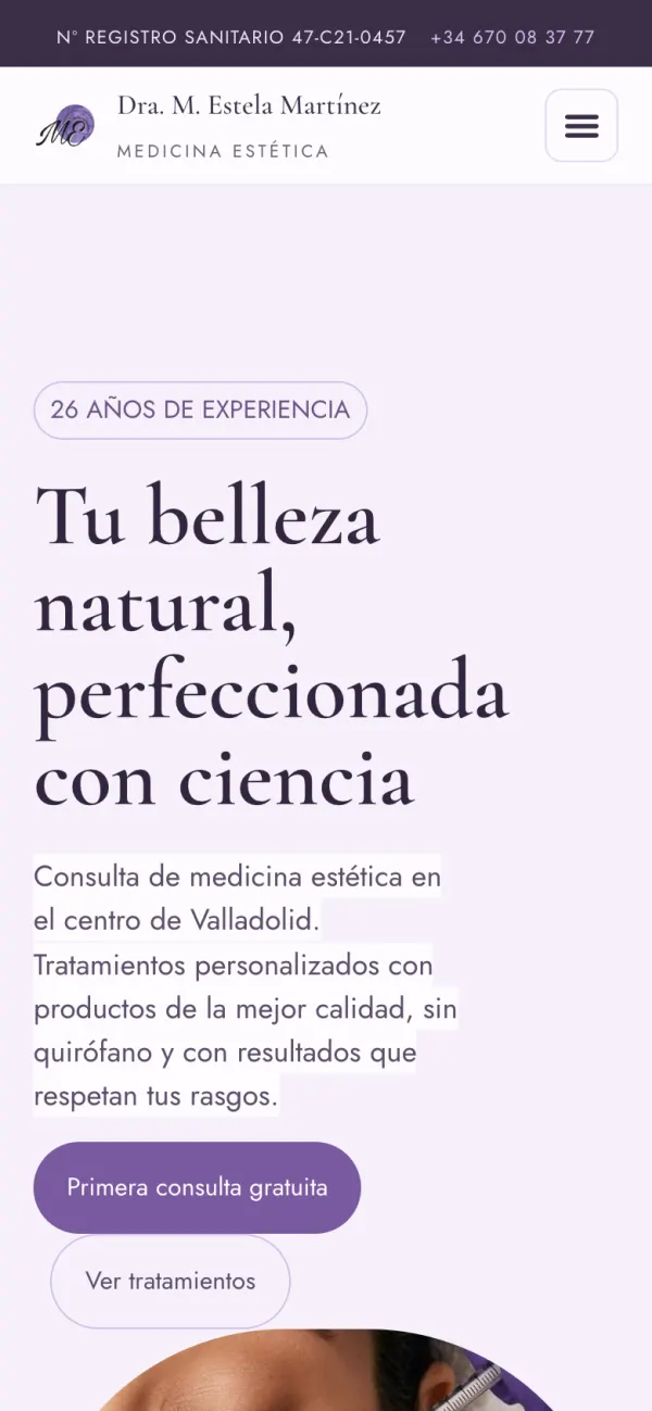
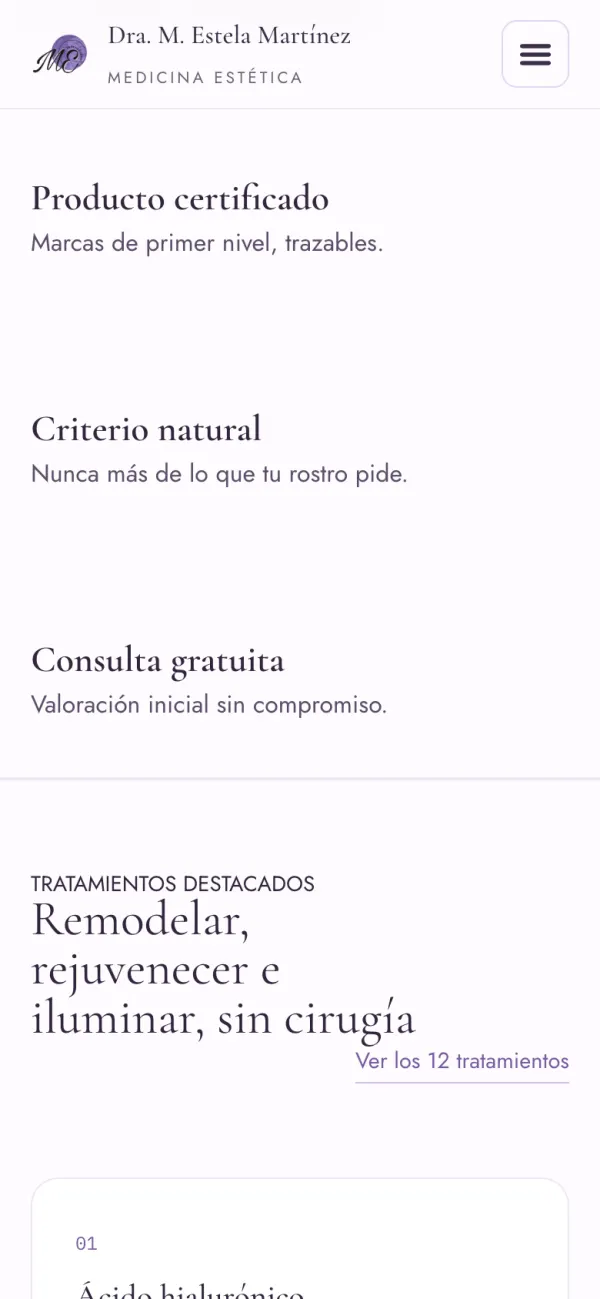
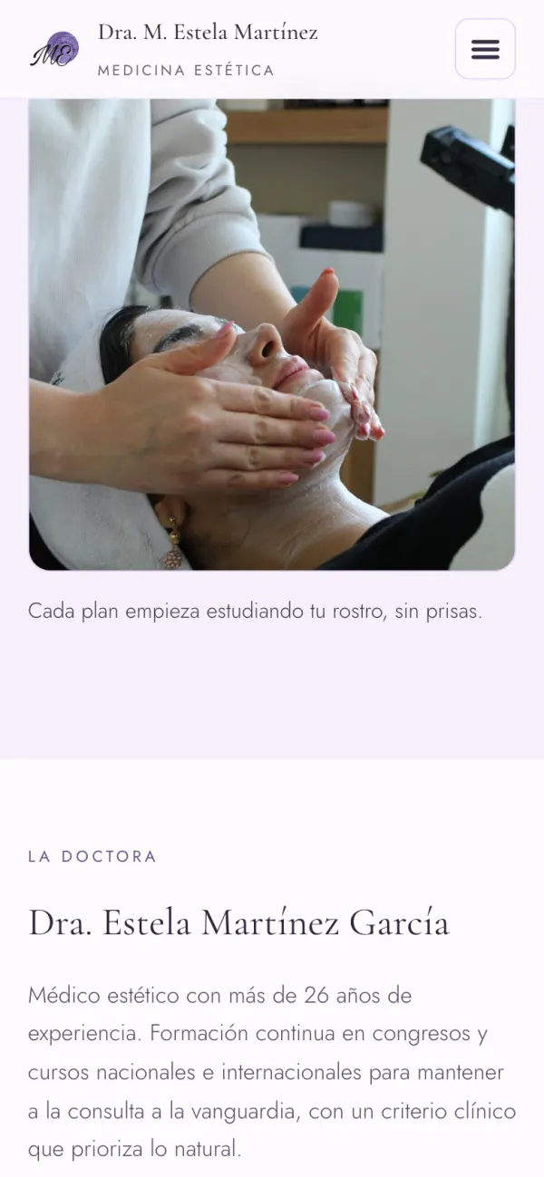
On a phone
A search for 'aesthetic medicine Valladolid' almost always happens on a phone. There the header keeps only the essentials — health registration and phone number — and the menu folds away so the homepage can breathe.
Decisions you don't notice
On a healthcare website, what isn't said matters as much as what is.
The registration, on the very first line
The health registration number opens the page, ahead of the logo. It's the first thing a sceptical visitor checks.
Subtle results, not miracles
No before-and-afters, no promises. 'Never more than your face asks for' is both a medical principle and a reassuring line.
One colour, one action
Mauve appears only where you book. So at any point on the page, the next step is visible without looking for it.
Questions answered before calling
The FAQ closes the homepage: pain, duration, recovery. What holds back a booking is answered on the same page.
Free assessment, no commitment
The call to action isn't 'buy' or 'book': it's a free first consultation. Asking for less makes the step easier to take.
Editable without fear
Every treatment comes from the same Elementor template. Changing one text can't break the design of the others.
The site in numbers
- 12treatments with their own card
- 3pages, plus the legal ones
- 7sections on the homepage
- 2typefaces
- 1colour reserved for booking
- 3legal pages
What I took away
In healthcare, restraint persuades
Promising less and showing the health registration does more for trust than any eye-catching headline.
Translate without losing the name
The technical name lends seriousness; the line beneath it, understanding. Both were needed.
WordPress when the client maintains it
It's not the tool I'd pick for an application, but for a practice that wants to edit its own copy, it's the right one.
A colour with a single job
Saving mauve for booking meant resisting using it anywhere else. That's what makes it work.
And in your case?
Does your practice or clinic need a website that conveys what you're like in person?
This one was for an aesthetic medicine practice, but the challenge — inspiring trust in seconds without over-promising — is the same for any healthcare professional. I take freelance projects alongside my job, and if you tell me about yours I'll say plainly whether I can help.
Tell me about it →